Displays information in a popup when a specified trigger is focused or hovered over
| 1 |
|
| 2 |
<div is-="tooltip"> |
| 3 |
<span is-="tooltip-trigger badge" variant-="background2">Hover me</span> |
| 4 |
<div is-="tooltip-content"> |
| 5 |
<p>Tooltip content</p> |
| 6 |
</div> |
| 7 |
</div> |
| 8 |
|
| 1 |
|
| 2 |
body { |
| 3 |
display: flex; |
| 4 |
align-items: center; |
| 5 |
justify-content: center; |
| 6 |
height: 100vh; |
| 7 |
} |
| 8 |
[is-="tooltip-content"] { |
| 9 |
background-color: var(--background1); |
| 10 |
padding: 1lh 1ch; |
| 11 |
width: 100%; |
| 12 |
} |
| 13 |
|
Import
@import "@webtui/css/components/tooltip.css";
Usage
<div is-="tooltip">
    <div is-="tooltip-trigger">Tooltip trigger</div>
    <div is-="tooltip-content">
        <p>Tooltip content</p>
    </div>
</div>
Examples
Positioning
| 1 |
|
| 2 |
<div class="row"> |
| 3 |
<div is-="tooltip"> |
| 4 |
<div is-="tooltip-trigger badge" variant-="background2">BR ↘</div> |
| 5 |
<div is-="tooltip-content" position-="bottom right"> |
| 6 |
<p>Tooltip content</p> |
| 7 |
</div> |
| 8 |
</div> |
| 9 |
<div is-="tooltip"> |
| 10 |
<div is-="tooltip-trigger badge" variant-="background2">BL ↙</div> |
| 11 |
<div is-="tooltip-content" position-="bottom left"> |
| 12 |
<p>Tooltip content</p> |
| 13 |
</div> |
| 14 |
</div> |
| 15 |
</div> |
| 16 |
<div class="row"> |
| 17 |
<div is-="tooltip"> |
| 18 |
<span is-="tooltip-trigger badge" variant-="background2">TR ↗</span> |
| 19 |
<div is-="tooltip-content" position-="top right"> |
| 20 |
<p>Tooltip content</p> |
| 21 |
</div> |
| 22 |
</div> |
| 23 |
<div is-="tooltip"> |
| 24 |
<span is-="tooltip-trigger badge" variant-="background2">TL ↖</span> |
| 25 |
<div is-="tooltip-content" position-="top left"> |
| 26 |
<p>Tooltip content</p> |
| 27 |
</div> |
| 28 |
</div> |
| 29 |
</div> |
| 30 |
|
| 1 |
|
| 2 |
body { |
| 3 |
display: flex; |
| 4 |
flex-direction: column; |
| 5 |
gap: 1lh; |
| 6 |
justify-content: center; |
| 7 |
height: 100vh; |
| 8 |
} |
| 9 |
.row { |
| 10 |
display: flex; |
| 11 |
gap: 1ch; |
| 12 |
aling-items: center; |
| 13 |
justify-content: center; |
| 14 |
} |
| 15 |
[is-="tooltip-content"] { |
| 16 |
background-color: var(--background1); |
| 17 |
padding: 1lh 1ch; |
| 18 |
} |
| 19 |
|
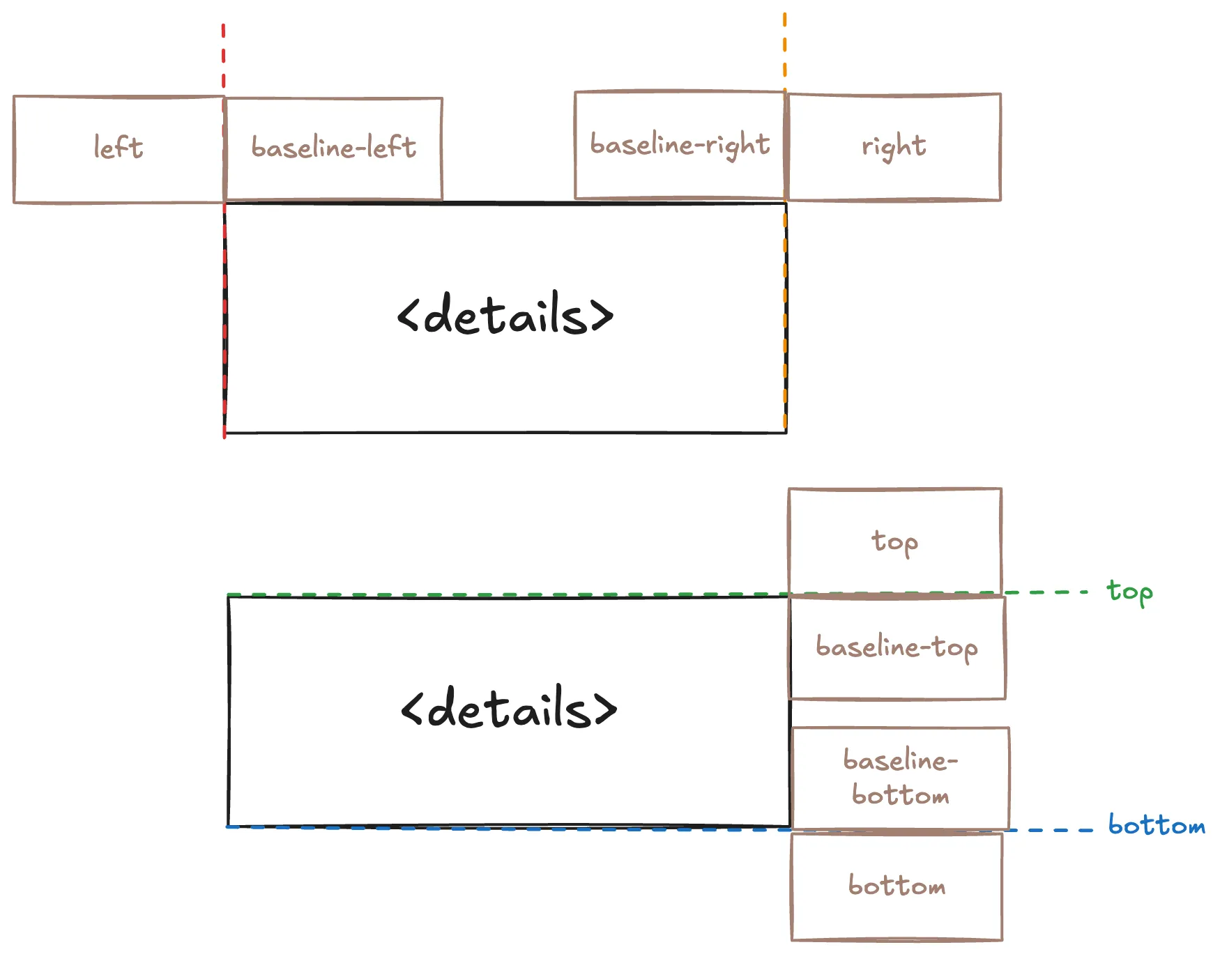
Use baseline-* values to position the content relative to the edges of the tooltip
| 1 |
|
| 2 |
<div class="row"> |
| 3 |
<div is-="tooltip"> |
| 4 |
<div is-="tooltip-trigger badge" variant-="background2">Bottom Baseline-Right</div> |
| 5 |
<div is-="tooltip-content" position-="bottom baseline-right"> |
| 6 |
<p>Tooltip content</p> |
| 7 |
</div> |
| 8 |
</div> |
| 9 |
<div is-="tooltip"> |
| 10 |
<div is-="tooltip-trigger badge" variant-="background2">Bottom Baseline-Left</div> |
| 11 |
<div is-="tooltip-content" position-="bottom baseline-left"> |
| 12 |
<p>Tooltip content</p> |
| 13 |
</div> |
| 14 |
</div> |
| 15 |
</div> |
| 16 |
<div class="row"> |
| 17 |
<div is-="tooltip"> |
| 18 |
<span is-="tooltip-trigger badge" variant-="background2">Right Baseline-Top</span> |
| 19 |
<div is-="tooltip-content" position-="right baseline-top"> |
| 20 |
<p>Tooltip content</p> |
| 21 |
</div> |
| 22 |
</div> |
| 23 |
<div is-="tooltip"> |
| 24 |
<span is-="tooltip-trigger badge" variant-="background2">Left Baseline-Top</span> |
| 25 |
<div is-="tooltip-content" position-="left baseline-top"> |
| 26 |
<p>Tooltip content</p> |
| 27 |
</div> |
| 28 |
</div> |
| 29 |
</div> |
| 30 |
|
| 1 |
|
| 2 |
body { |
| 3 |
display: flex; |
| 4 |
flex-direction: column; |
| 5 |
gap: 1lh; |
| 6 |
justify-content: center; |
| 7 |
height: 100vh; |
| 8 |
} |
| 9 |
.row { |
| 10 |
display: flex; |
| 11 |
gap: 1ch; |
| 12 |
aling-items: center; |
| 13 |
justify-content: center; |
| 14 |
} |
| 15 |
[is-="tooltip-content"] { |
| 16 |
background-color: var(--background1); |
| 17 |
padding: 1lh 1ch; |
| 18 |
} |
| 19 |
|
This image from the Popover page shows the values and positions that can be used in the position- property
Reference
Properties
--tooltip-offset-x: The horizontal offset of the tooltip--tooltip-offset-y: The vertical offset of the tooltip--tooltip-delay: The delay before the tooltip appears
#my-custom-tooltip {
    --tooltip-offset-x: 1ch;
    --tooltip-offset-y: 1lh;
    --tooltip-delay: 0.5s;
}
Extending
To extend the Tooltip stylesheet, define a CSS rule on the components layer
@layer components {
    [is-~="tooltip"] {
        &[variant-="inverted"] {
            /* ... */
        }

        /* ... */
    }
}
Scope
- All elements with the
is-~="tooltip" selector
- Children of
is-="tooltip" with the is-~="tooltip-trigger" selector
- Children of
is-="tooltip" with the is-~="tooltip-content" selector
[is-~="tooltip"] {
    [is-~="tooltip-trigger"] { /* ... */ }
    [is-~="tooltip-content"] { /* ... */ }
}